
diff options
| author | altaf-creator <dev@altafcreator.com> | 2026-06-28 23:55:39 +0800 |
|---|---|---|
| committer | altaf-creator <dev@altafcreator.com> | 2026-06-28 23:55:39 +0800 |
| commit | b8e0094052a2947bbf9e40147050d18ae2d94420 (patch) | |
| tree | 90a9964387e51ffda16ea34d8b44d9925de6c56b /data/projects | |
| parent | 3abcae19fefd11bbfba6cbf696b342ea72da6992 (diff) | |
url changes
Diffstat (limited to 'data/projects')
| -rw-r--r-- | data/projects/deja.md | 2 | ||||
| -rw-r--r-- | data/projects/laundryweb.md | 45 |
2 files changed, 33 insertions, 14 deletions
diff --git a/data/projects/deja.md b/data/projects/deja.md index d2806dd..23220c4 100644 --- a/data/projects/deja.md +++ b/data/projects/deja.md @@ -140,7 +140,7 @@ The following section is a brief explanation about this competition and notes on NASA Space Apps Challenge is an annual global 48-hour online hackathon held by NASA where developers and enthusiasts come together and build open-source projects focusing on tackling problems on Earth and space. Participants can (and are encouraged to) utilise free and open data provided by NASA and its partners (like the European Space Agency). -In the Sec 3 end of year holidays in 2025, a couple of my friends from Ngee Ann Secondary and Dunman Secondary School and me decided to team up and join the universal event (as basically nobody participated in local Singapore events) for this competition. +In the Sec 3 end of year holidays in 2025, a couple of my friends from Ngee Ann Secondary and Dunman Secondary School and I decided to team up and join the universal event (as basically nobody participated in local Singapore events) for this competition. We formed into a team of five, me, J from Ngee Ann, W from Ngee Ann, D from Dunman, and E from Dunman. diff --git a/data/projects/laundryweb.md b/data/projects/laundryweb.md index 85c86bb..4b678eb 100644 --- a/data/projects/laundryweb.md +++ b/data/projects/laundryweb.md @@ -26,15 +26,22 @@ A simple laundry timer website/web application for all Victoria Hall boarders. Do check out the source code [here](https://git.altafcreator.com/victoriahall-laundryweb.git/)! -## Purpose {: #purpose} +# Features + +* A highly efficient and easy-to-use timer, optimised for using the laundry machines in Victoria Hall communal laundry rooms. + * This timer is run on the backend, so users won't need to keep the page open. +* A status page. People may bookmark this page and see the current usage status of washers and dryers in their block, and can decide when to start their laundry accordingly. + * This is possible since the timers are saved and run on the backend. We can infer all machines usage status from the existence of these timers. + +# Purpose {: #purpose} I created this app because I noticed a fairly frequent problem, or frankly an annoyance, in my student hostel. Oftentimes, especially in the male block, residents are found to leave their laundry inside a machine for extended periods of time despite having their laundry fully washed or dried. When another person wants to use that machine, they will need to take out the previous person's laundry and those clothes often end up on top of machines and floors. This creates annoyance and a slight delay for the next person wanting to use that machine, and also makes the place less hygienic and more cluttered. Perhaps this may be caused due to people forgetting their own laundry. Personally, I'll always bring my phone to start a 25-minute timer whenever I start a new laundry cycle, so that I won't forget about it. It's pretty quick to do, but it may still be an additional friction for some people, so people may choose not to do that at all. Thus, I proposed a new website project for a simple laundry timer that is easily accessible and very quick to use for residents wanting to wash their laundry quickly. When their laundry is finished, they will be notified and can promptly take their laundry. The aim is to make starting a timer to notify yourself about your own laundry **as frictionless as possible**. -## State of Project (Update/remove soon) +# State of Project -Currently, the project is almost finished. All the main features of the app are finished, and I think it's ready for production. Therefore, the next steps of LaundryWeb's development is testing the application with real users, especially iPhone users, and also consulting with Hall Office for deployment and logistics. +Currently, the project is almost finished. All the main features of the app are finished, and it's ready for production. Therefore, the next steps of LaundryWeb's development is testing the application with real users, especially iPhone users, and also consulting with Hall Office for deployment and logistics, which is ongoing this week as of 29 June 2026. -+-+-+ @@ -50,28 +57,40 @@ Here's what I've learnt from the development process of LaundryWeb. During the making of this project, user-friendly design was the main focus. I wanted the app to be as efficient to use as possible as I know there are a lot of users using my hostel's communal laundry rooms, and people don't want to spend extended periods of time just starting their laundry. Ideally, people should be able to scan a LaundryWeb QR code, and immediately know how start a timer and receive notifications of their laundry within 30 seconds without reading a manual. This project really exercised my design skills to create a good and intuitive user experience for the app. -### User Journey +### User Journey { #user-journey } - +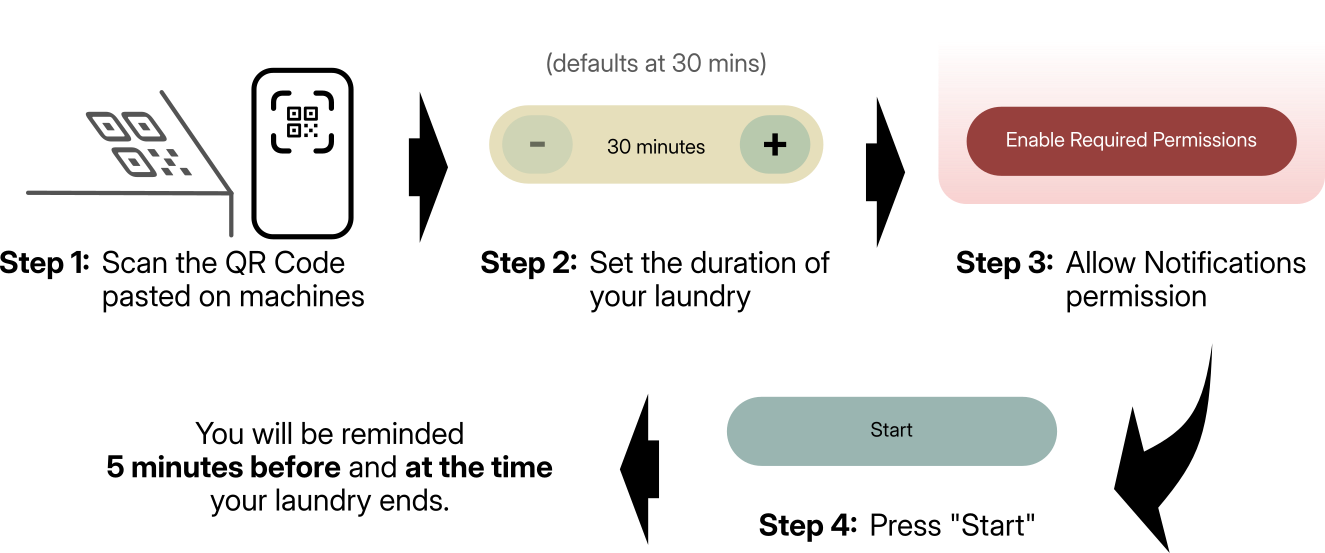 +{: .max-img } <div markdown="1" class="flex-flex"> First, I'd want the simplest, quickest, and most intuitive user journey as possible. This is to make the process of using the app, and hence using communal laundry rooms as frictionless as possible. If the app instead adds additional friction in doing laundry and starting your own timer, then it **defeats** the whole [purpose](#purpose) of this app. -In the end, I created this flow +In the end, I created this flow. When a new user wants to use LaundryWeb, they will start by scanning a QR code pasted on the machine they want to use. Then, the user will need to enable notifications permissions, and finally, press "Start". And that's it! They will be notified 5 minutes before and at the time when their laundry ends. -### UI Design +### UI & UX Design -{{{ -<div class="flex-flex" markdown="1"> The User Interface (UI) design is also a major part of making the user experience as intuitive as possible, aligned with my aims to make [starting a timer to notify yourself for your own laundry as frictionless as possible](#purpose). In fact, user interface **is** part of the user experience, hence making sure LaundryWeb has "good" UI design is also very critical for my aim. -I settled on these design philosophies for LaundryWeb's UI that I think aligns with my UX goal: **simple** and **humane**. +I settled on these design philosophies for LaundryWeb's UI that I think aligns with my UX goal: **simple** and **humane**. + +#### Simple + +Every page of LaundryWeb should be **as simple as possible**, both in terms of the tech behind it and what is shown to the user. This is so that the user can immediately finish the task that they want to do, whether starting a timer or confirming laundry collection. For instance, each page should have a clear, singular purpose, and each element in the page should align to that purpose. If not, cut it. + +For user navigation, I've adopted a "zero-navigation" approach to adhere to this design philosophy. Any point of entry, whether entering LaundryWeb's URL, opening the PWA from home screen, or interacting with a LaundryWeb notification, should immediately redirect to the relevant action that the user wants to do. For instance, a user that received a notification that their laundry has been finished should be redirected into their laundry timer page instead of machine status page, so that they can quickly confirm the collection of their laundry. Conversely, users that are looking to use the laundry machine may open the web app via PWA or a browser to check the machines' status. This user should redirected to the status page instead of an empty timer page. + +This philosophy also relates to and complements my earlier point about [User Journey](#user-journey). +#### Humane + +At the same time, the design should still feel **friendly** and **accessible**. Even though I aim to make this app to be used very quickly, I also want the experience to be pleasant, so that users won't feel "forced" to use this app. To achieve this, a warm colour palette for all web elements is used. Elements like buttons and sections also feature rounded corners, which hopefully makes the app feel more "welcoming". Rounded corners are also a pretty familiar feature that users have already seen all over the internet anyway. Lastly, fancy but unnecessary elements should be minimised, so that a wide range of devices can render the app properly, and so that accessibility tools can parse the website well. + +{{{ + +<div class="flex-flex" markdown="1"> +An example of my attempt to apply my UI philosophies is at the very first page a new user will see, the start timer page (`/start/`). This was also the very first page I designed to have a feel of what I want the whole app to look like. -Every page of LaundryWeb should be **as simple as possible**, both in terms of the tech behind and what is shown to the user. This is so that the user can immediately finish the task that they want to do, whether starting a timer or confirming laundry collection. For instance, each page should have a clear, singular purpose, and each element in the page should align to that purpose. If not, cut it. Navigation should be as simple as possible. In fact, the user should not need to navigate through different pages just to do one task. Make navigation as minimal as possible, and again, if needed, make it simple. -At the same time, the design should still feel **friendly** and **accessible**. Even though I aim to make this app to be used very quickly, I also want the experience to be pleasant, so that users won't feel "forced" to use this app. To achieve this, I decided to create sea green colour palette that in which every element must use. I also decided that elements should have rounded corners, to make the app feel more "welcoming", and it's also a pretty familiar feature that users have already seen all across the internet. Fancy but unnecessary elements should be minimised, so that a wide range of devices can render the app properly, and so that accessibility tools can parse the website well. -An example of my attempt to apply my UI philosophies is at the very first page a new user will see, the start timer page (`/start/`). This was also the very first page I designed to have a feel of what I want the whole app to look like. I think this page has manifested all of my desired design philosophies. </div>  |